Context
One of my favorite classes in college was CS 52: Full Stack Web Development. I took this class my senior spring, so it was one of my final classes at Dartmouth and the last CS course I took. It was a bittersweet feeling to know that I was working on the last CS project of my undergraduate career. I was very motivated to create a product that I could be proud of. MeU was my final group project for the course, and it is not only the project that I am most proud of from a technical standpoint, but also the one that challenged me the most because of the leadership role and development responsibility that I took upon myself.
The Problem
MeU was pitched as a mobile app for couples in long-distance relationships to maintain contact and foster their connection. It was an opportunity to think about how to solve the problem of connecting people across space and time (zones). This produced a lot of interesting design problems such as 1) how to maintain engagement with the app, 2) how to encourage people to use the app instead of choosing other methods of spending time together (FaceTime, messaging, games, etc.), and 3) how to market the app if we decided to launch to an app store.
Link to GitHub Repository
The Solution: Home
The home page has three main features. The first is that users can change their partner’s wallpaper to whatever photo they’d like. This means that when their partner opens the app, they can be surprised with a photo that the user wanted to share with them. The second feature is the information display that shows both you and your partner’s location, local time, and temperature. Lastly, the shared calendar feature tracks important dates like the couple’s anniversary and birthdays, which users provide during the registration process. Couple can also create other important events that recur on a weekly, monthly, or yearly basis.
This activity was the most difficult to implement because it primarily involved researching and utilizing APIs that could access a user’s camera roll, display and add events to a calendar, and access user data like location, temperature, and timezone.
A gif demonstrating the wallpaper feature.
A gif demonstrating the daily check-in.
The Solution: Daily Check-In
This feature prompts couples to answer a unique daily question about their partner. If your partner answers the question first, then you will only be able to see the answer once you submit an answer yourself. This serves multiple purposes. For one, it encourages users to respond to the question without their partner's answer influencing them. Secondly, it requires that both users engage with the app to fully use the feature.
The challenge we faced with this feature was generating a unique list of questions. We produced a fair amount of questions on our own, but it would not have been sustainable post-deployment without significant maintenance. If I could spend more time on this project, I would want to find a way to make this feature self-sustaining - perhaps by using generative AI to create questions.
A gif demonstrating the penguin emote feature.
The Solution: Penguin Emotes
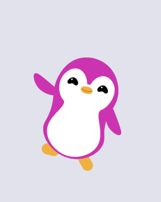
We chose penguins as our customizable avatars because penguins mate for life, which aligned with our goal to encourage lasting relationships. When thinking of features that could do that, we wanted a way for users to communicate that didn’t require as much effort as sending a text message or making a phone call. Being constantly engaged in a long-distance relationship can be taxing if you’re in different time zones or have different schedules. Sending an emote is a way to let your partner know how you’re doing asynchronously and without having to verbalize your emotions.
We were extremely lucky to have an experienced animator on our team. He created all the emote animations we used in the app and brought the design to another level.
User Registration
Registration was the most time-intensive part of the app to develop because it had the most screens, and each screen did something unique. We were also very thorough with the registration process. We implemented sign up, log in, change password, and a Terms and Conditions page - which even I didn’t read. The sign up process was the most difficult to implement because the app is not functional without a partner. Figuring out how to link two partners was challenging, but we ended up creating random pair codes that users sent to their partners to use when they create their account. We then had to stop them from moving past that screen until they had a paired partner.
Looking back on this part of the project, I think I would’ve preferred to try to minimize the number of screens we created for the sign in process. I believe much of it could’ve been done on the same page which would’ve both reduced extra clicks for the user and minimized developer time, which was important because we only had around four weeks to complete the project.
My Contribution
My team consisted of six members. Three members were also in a CS25, a design course that partnered with CS52 to both design and implement a product. For this project, they took point on the design portion of the project, gathering research data and leading design meetings with group. For the development side of things, I was the primary full-stack developer that managed the team’s implementation progress. I developed the entire backend using FireBase and the frontend of user registration. A significant portion of my time was also spent pair coding with my teammates on other components of the app.


